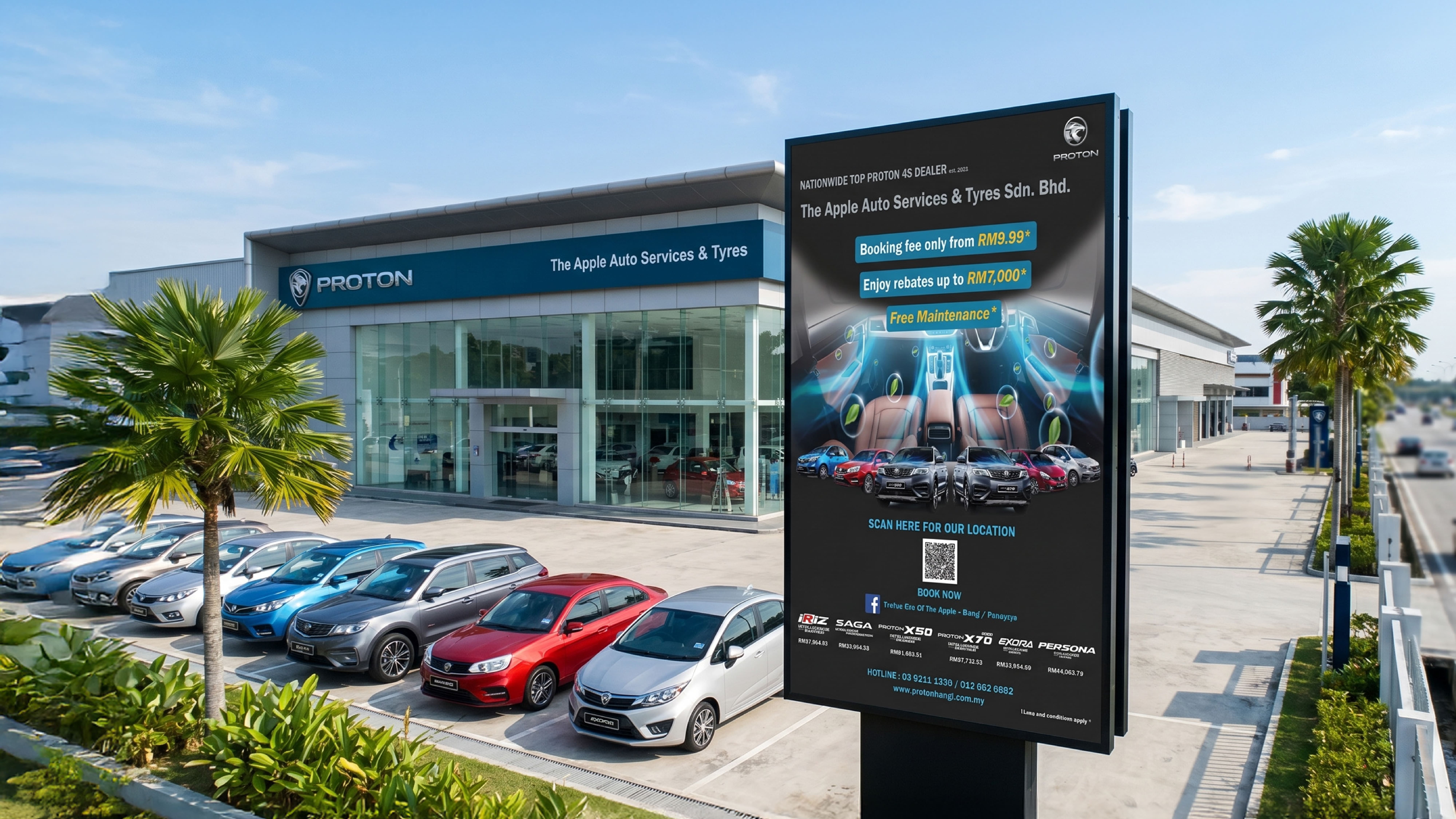
High-impact designs for dealerships, adhering to brand standards while optimizing for local conversion and engagement.
02
Illustrations
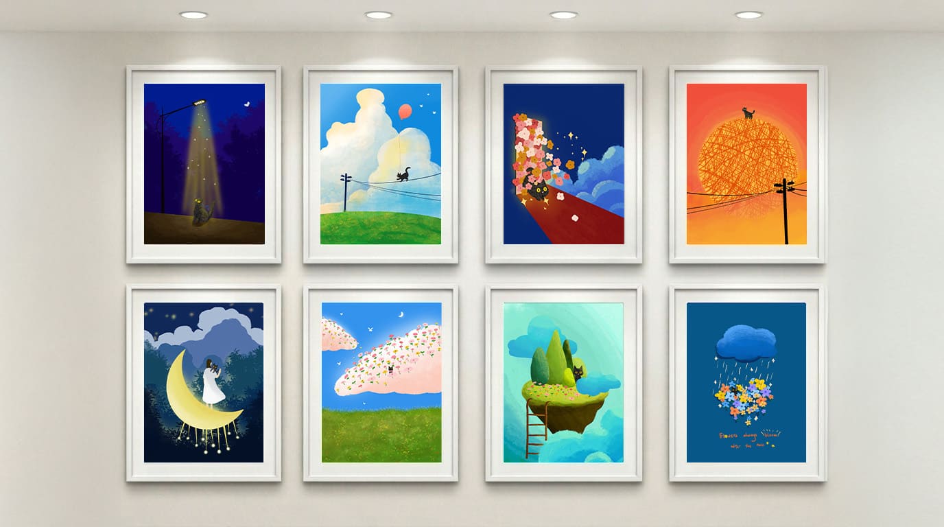
From the initial concept and line art to the final rendering, this layout offers a quick glance into how each creation comes to life from scratch.
03
Amthys Paris Social Media Campaign
Developed a comprehensive visual solution for luxury skincare brand Amthys Paris across various high-traffic social media campaigns (e.g., Facebook, Instagram).
04
China-Malaysia 50th Anniversary Visual
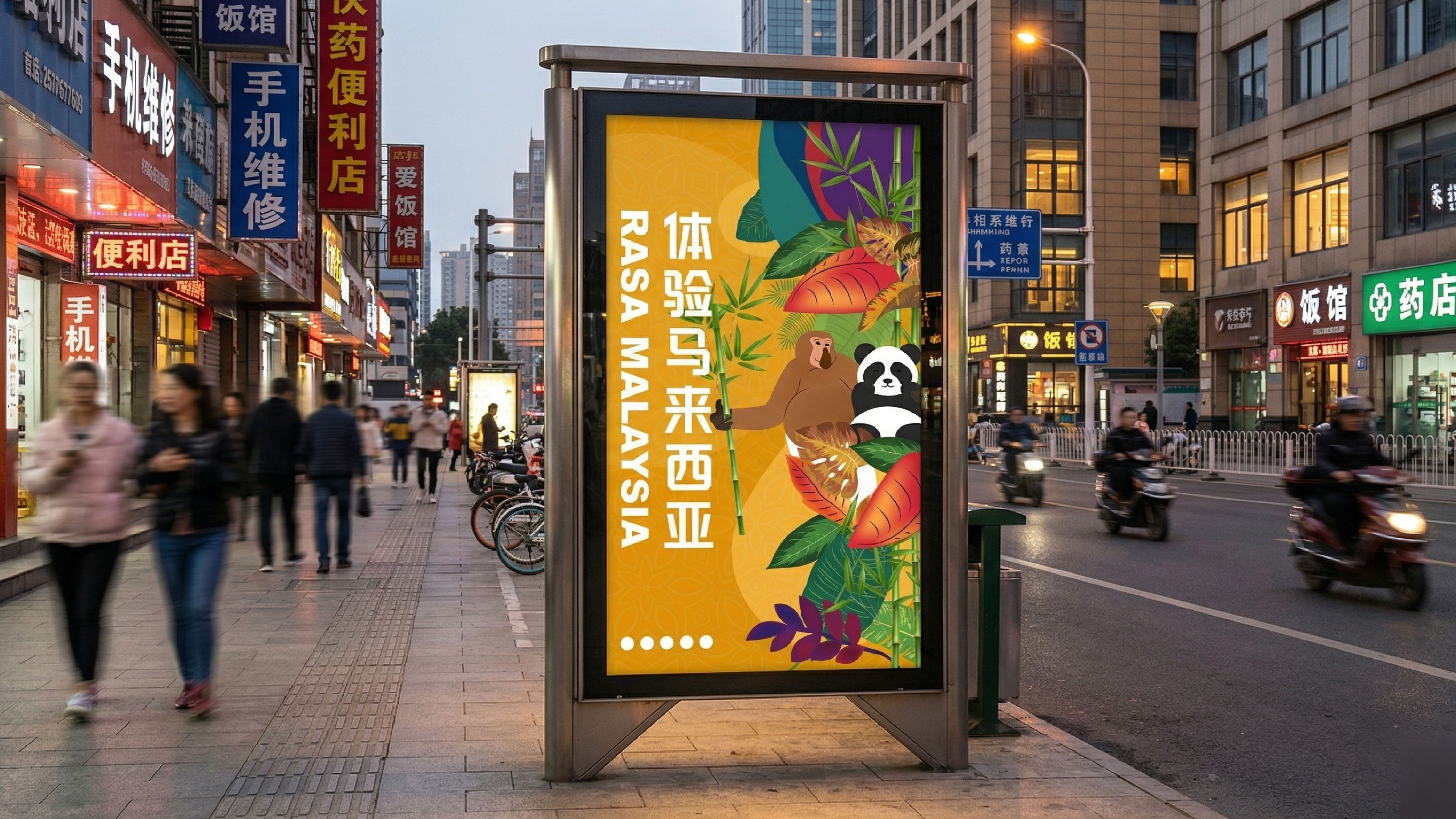
Celebrating diplomacy through Panda and Proboscis Monkey symbols, using Batik motifs to promote Malaysia tourism.
05
Exotic Lover Pet Centre
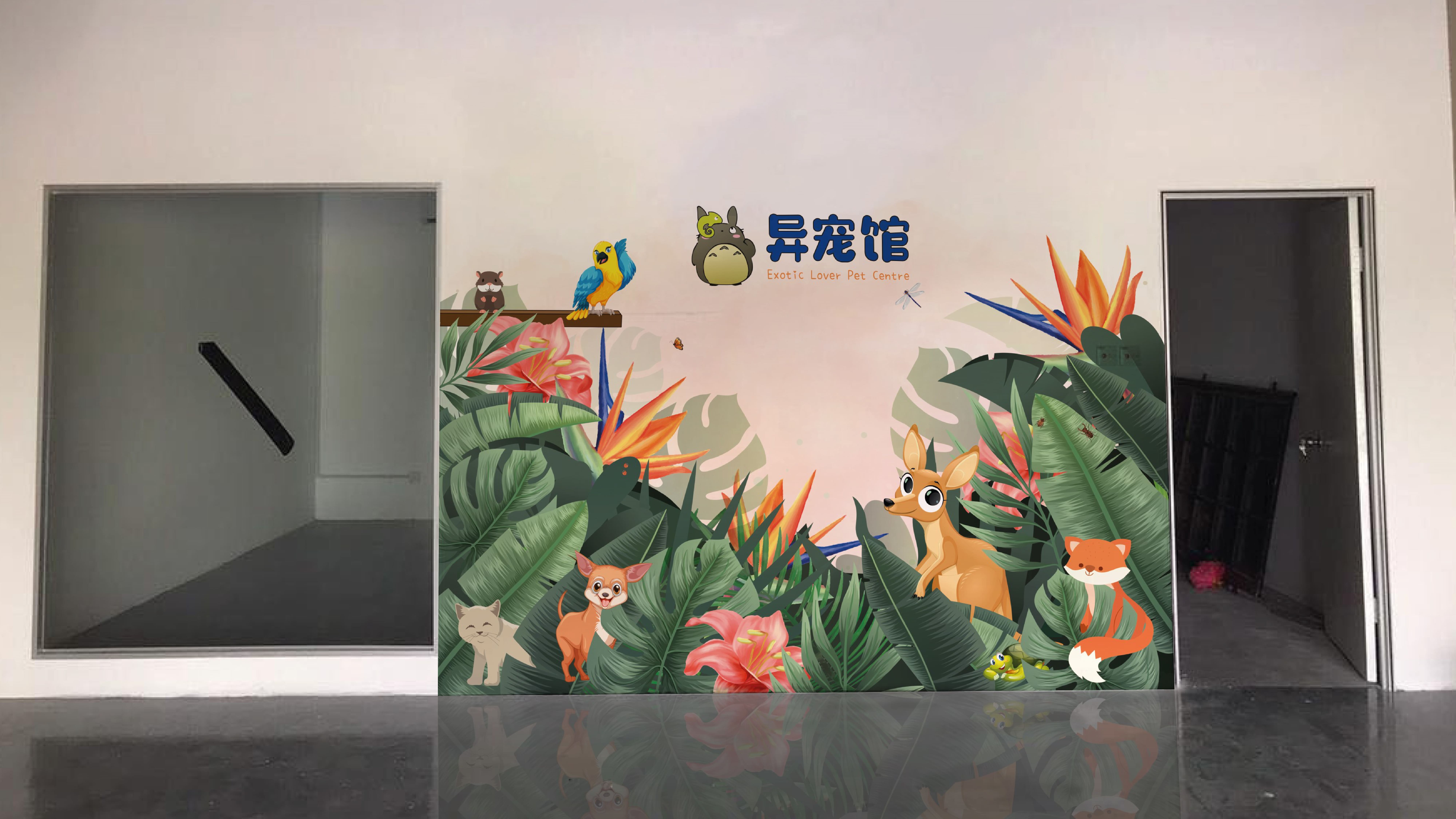
A large-scale jungle-themed wall sticker that transforms a plain interior wall into a vibrant focal point.
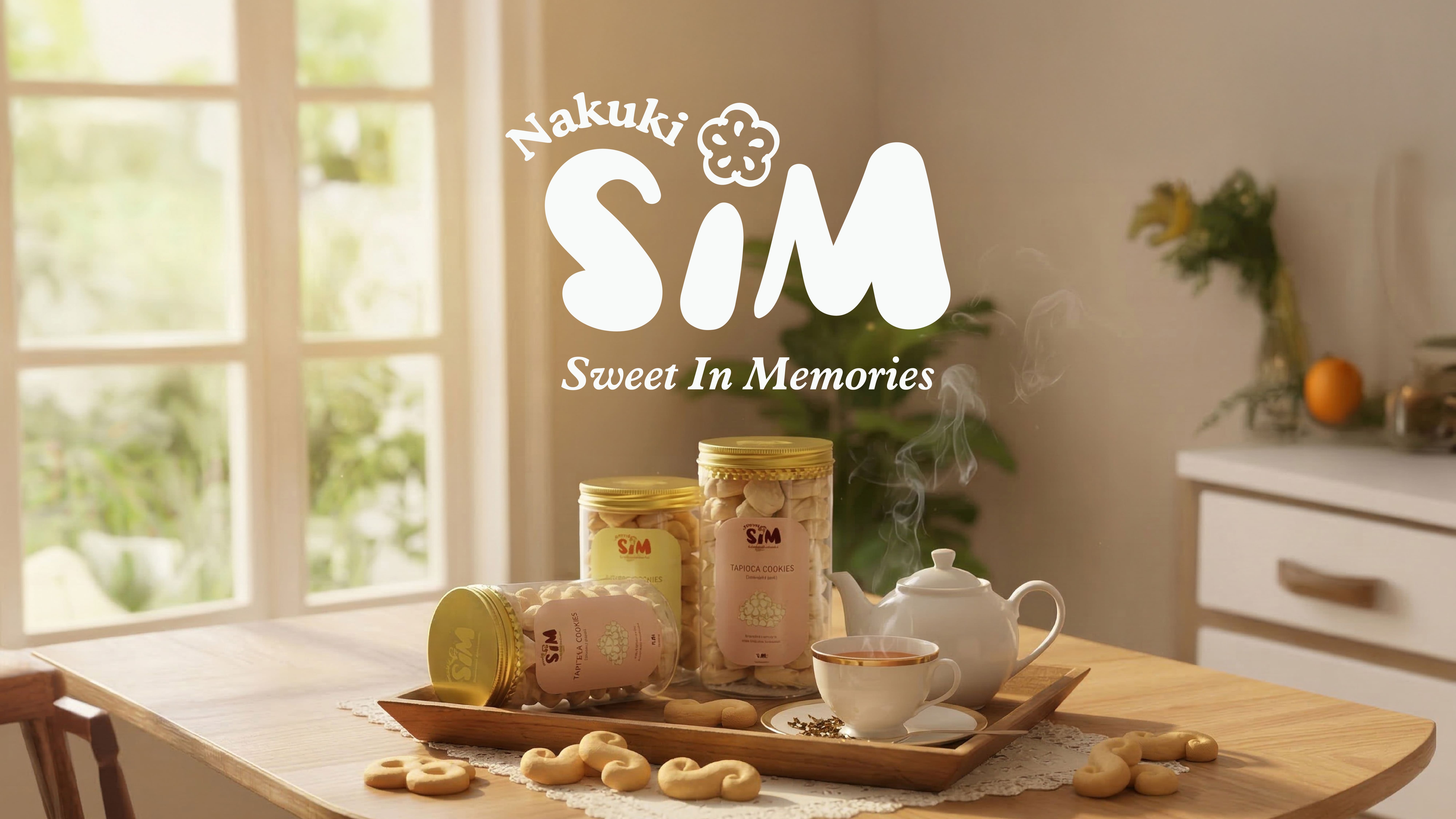
A brand identity for Madam Sim’s traditional handmade cookies. The design blends the warmth of heritage recipes with modern minimalist packaging to evoke pure memories of taste.
A brand identity for Madam Sim’s traditional handmade cookies. The design blends the warmth of heritage recipes with modern minimalist packaging to evoke pure memories of taste.
02
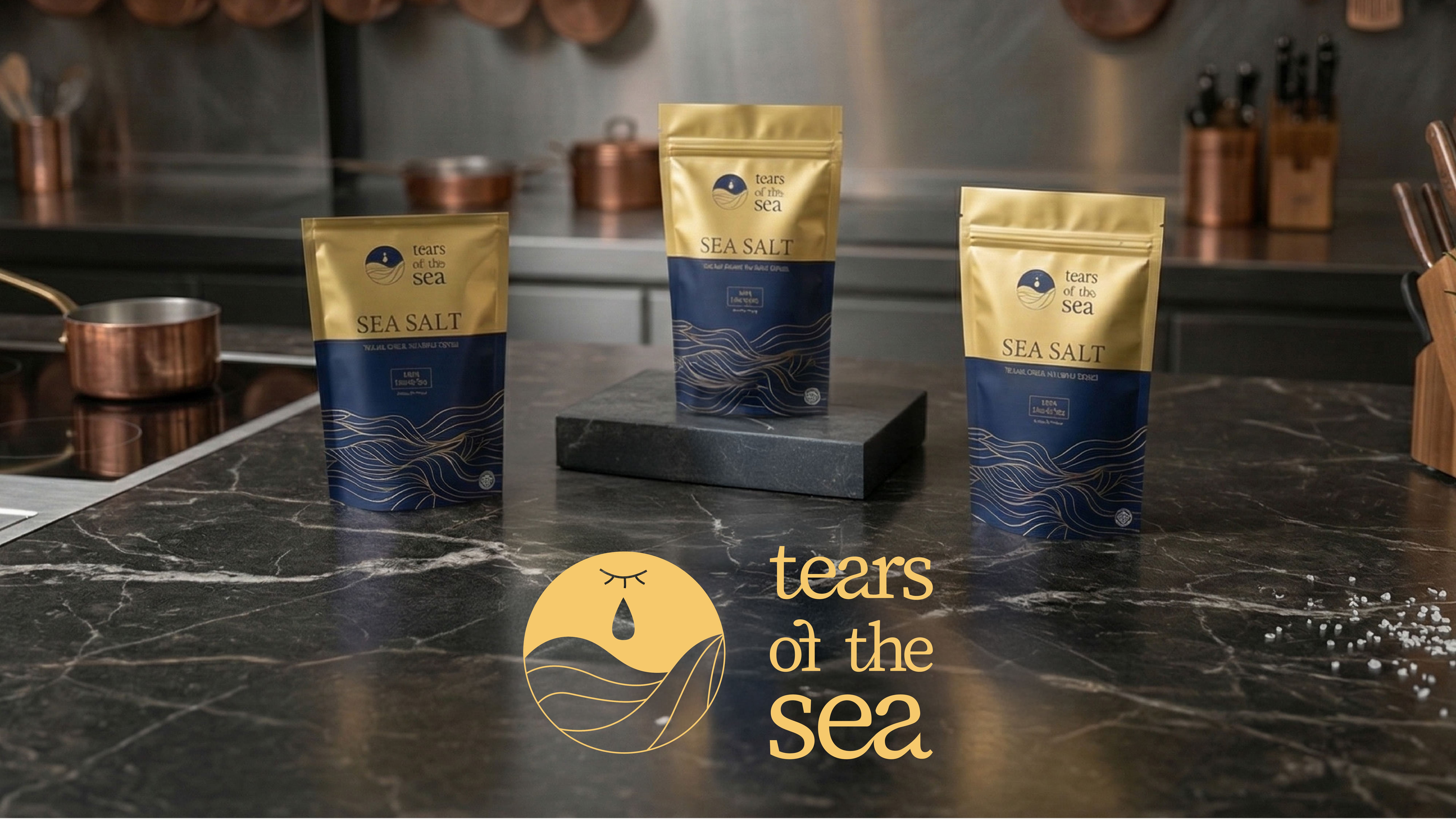
Tears of the Sea
A premium artisanal salt brand built on the concept that “salt is the ocean’s tears.” The identity blends deep navy and warm gold with fluid wave-like typography, elevating everyday culinary experiences into a sensory journey of emotion and freedom.
03
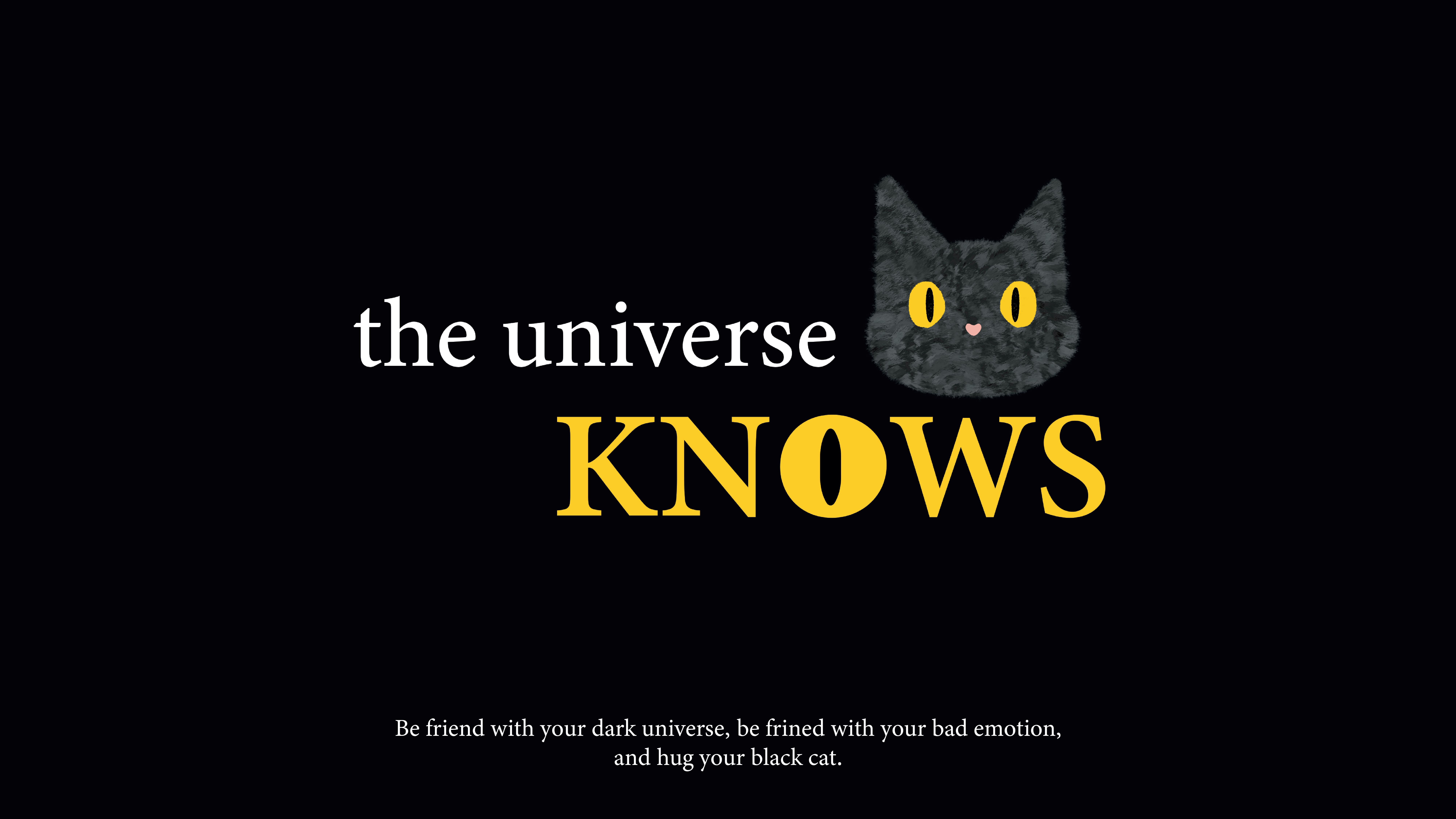
The Universe Knows
A healing brand for youth mental health. Centered on a "Black Cat" anchor, it uses a trilogy of Listening, Watching, and Feeling.
04
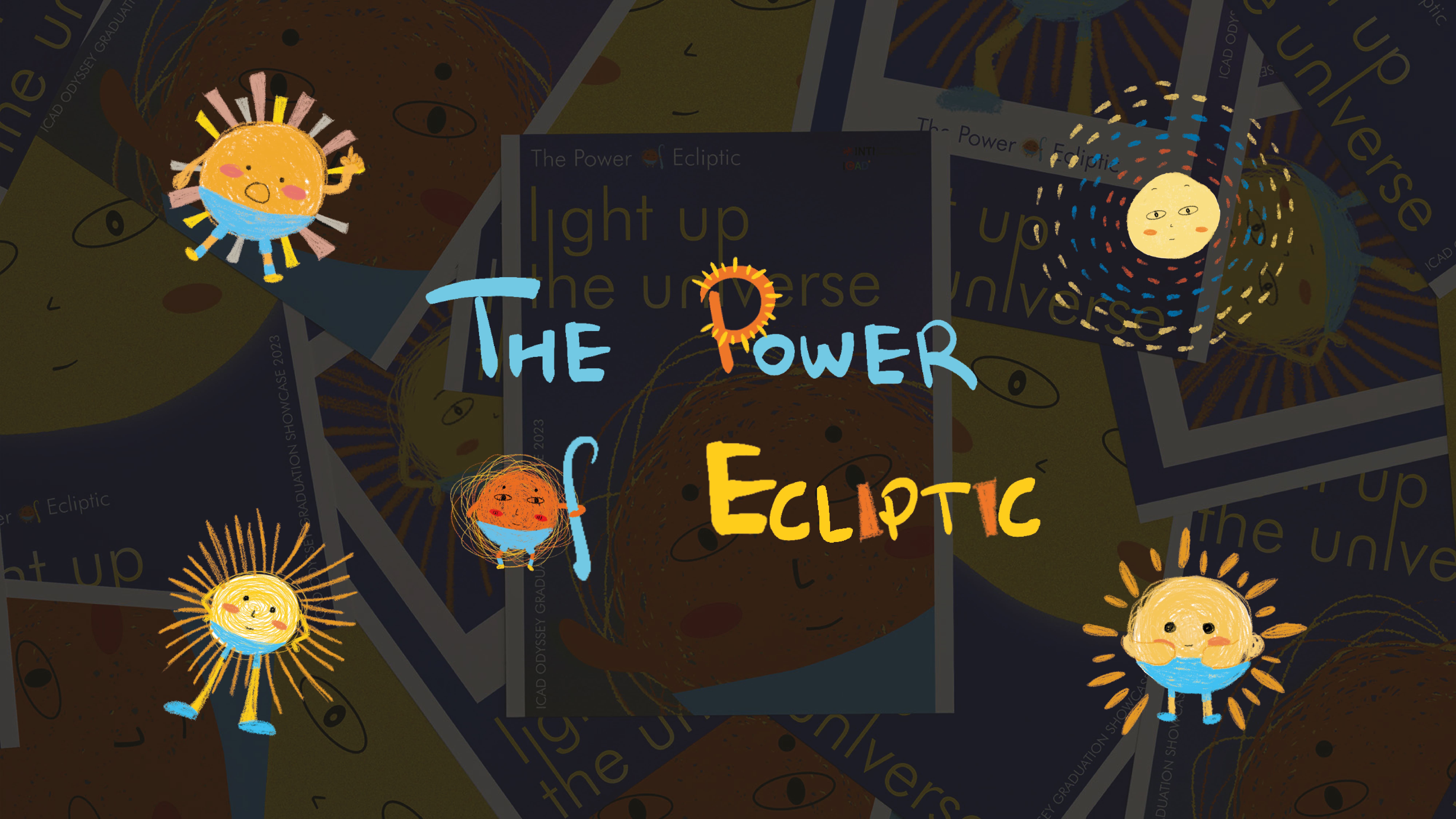
The Power of Ecliptic
Metaphors the "Designer" as the "Sun," using the 24 Solar Terms to represent the multifaceted dimensions of the creative process.
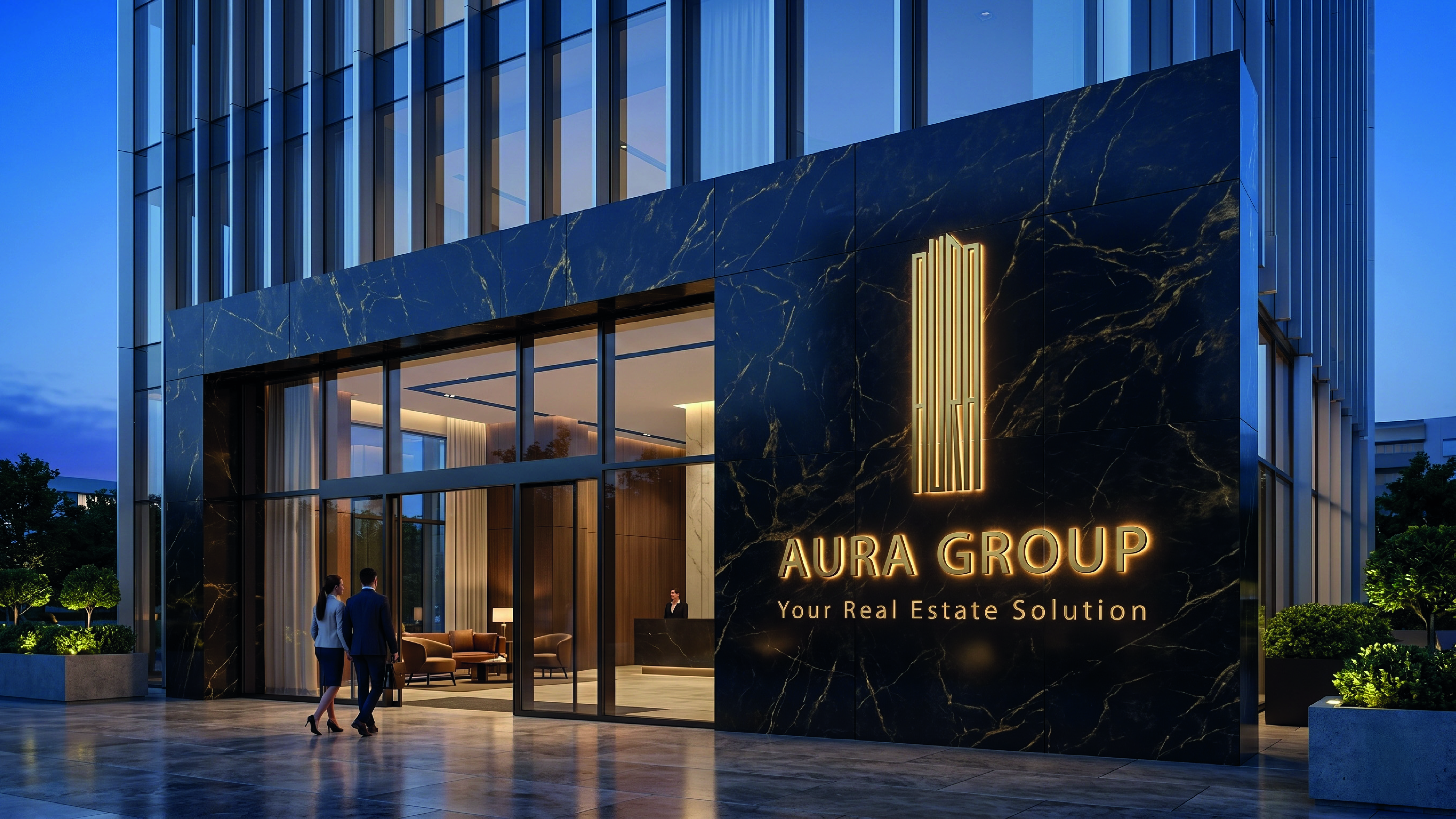
A brand identity for a real estate solution provider. The logo transforms the brand name into a modern condominium silhouette, symbolizing stability and urban growth.
A brand identity for a real estate solution provider. The logo transforms the brand name into a modern condominium silhouette, symbolizing stability and urban growth.
02
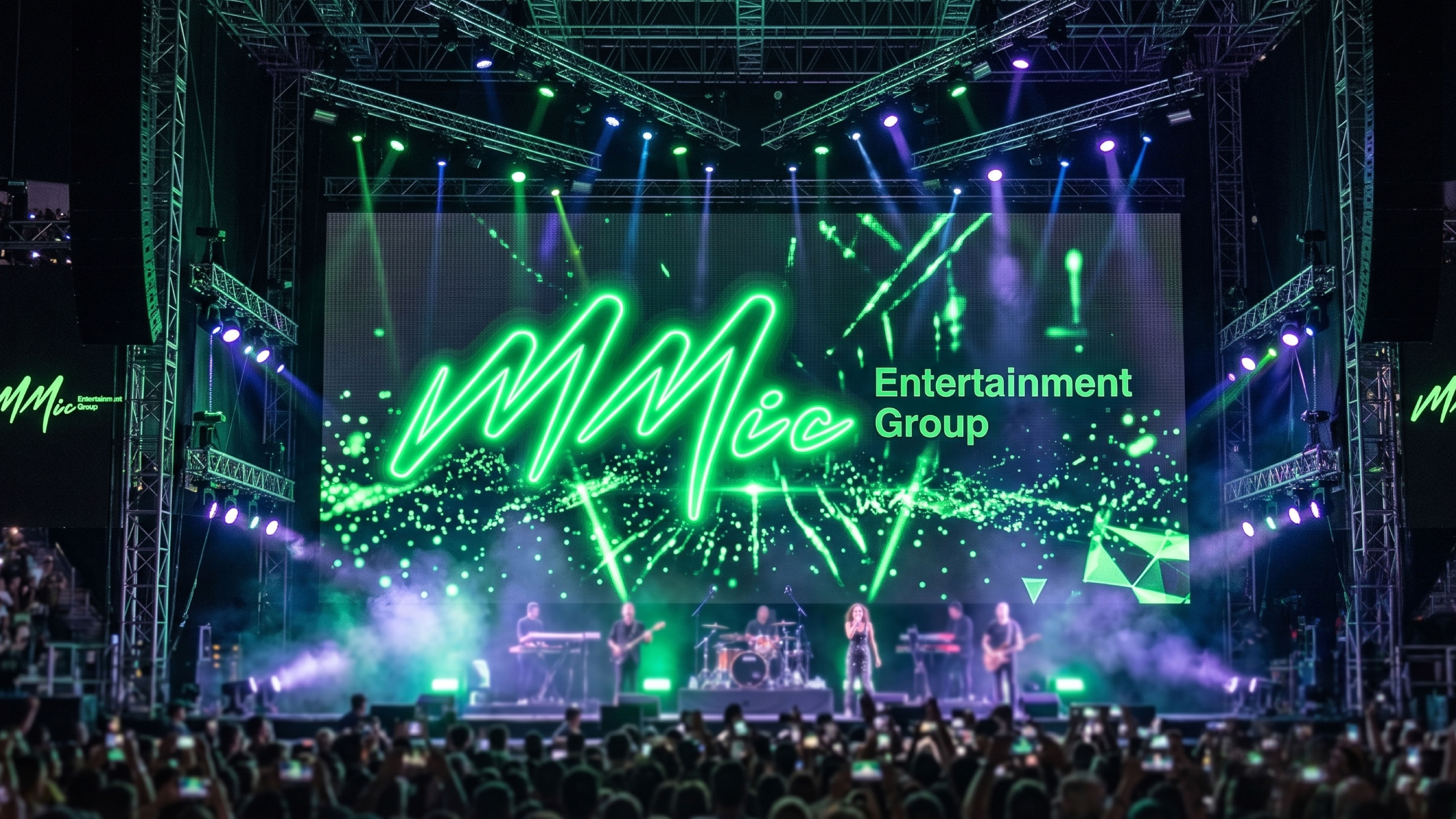
MMIC Entertainment Group
A logo redesign for an entertainment group. The project involved reconstructing a double "M" structure to correct previous logical inconsistencies and significantly improve brand recognition.
03
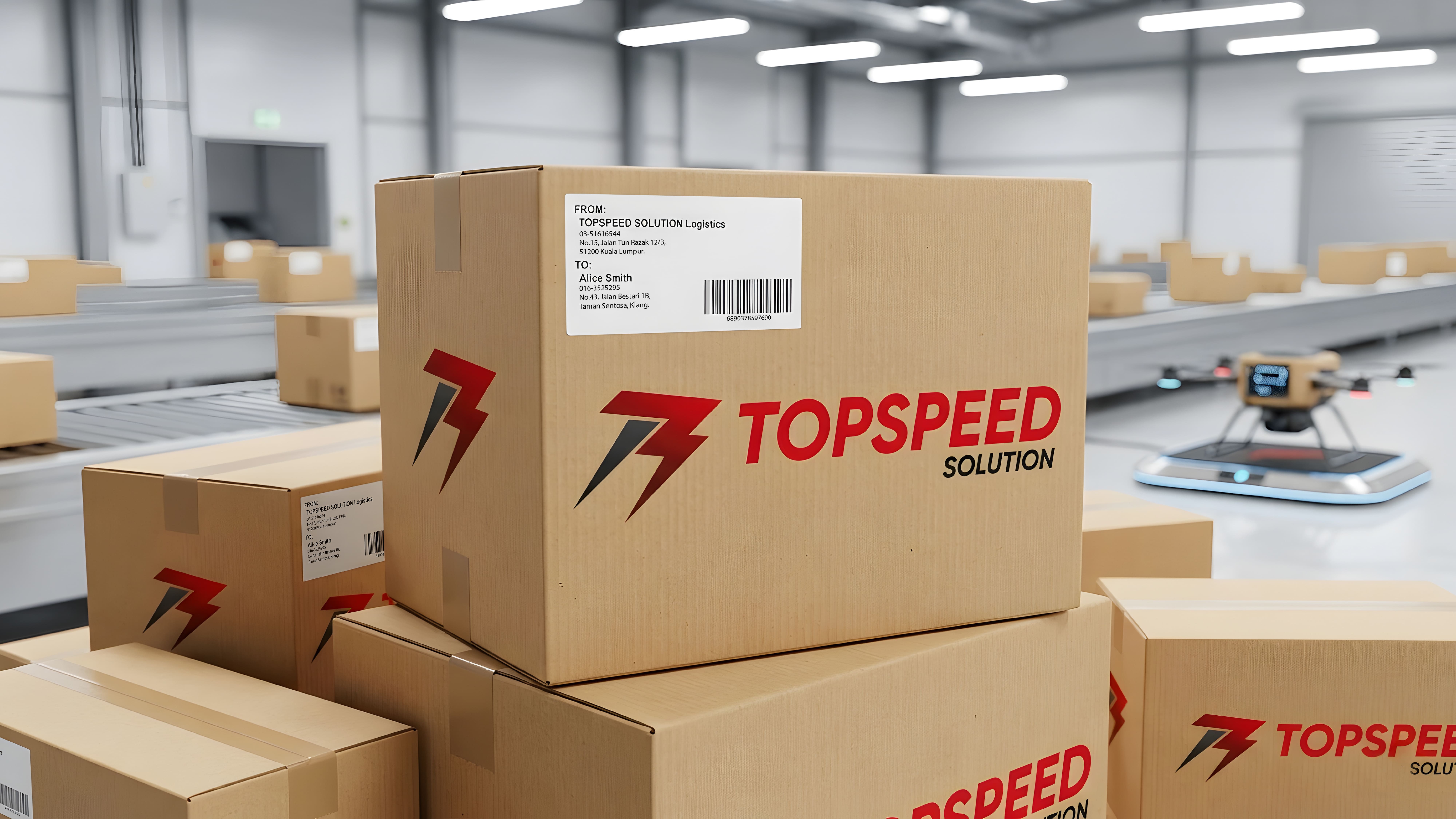
Topspeed
A brand identity for a logistics and express delivery company. The geometric symbol incorporates the letter "T," a lightning bolt for speed, and the number "3" as a tribute to the company’s three founders.
A visual publication designed to bridge the emotional gap between young adults and their middle-aged parents. It utilizes the slow development of cyanotype as a metaphor for the irreversible nature of aging.
A visual publication designed to bridge the emotional gap between young adults and their middle-aged parents. It utilizes the slow development of cyanotype as a metaphor for the irreversible nature of aging.
02
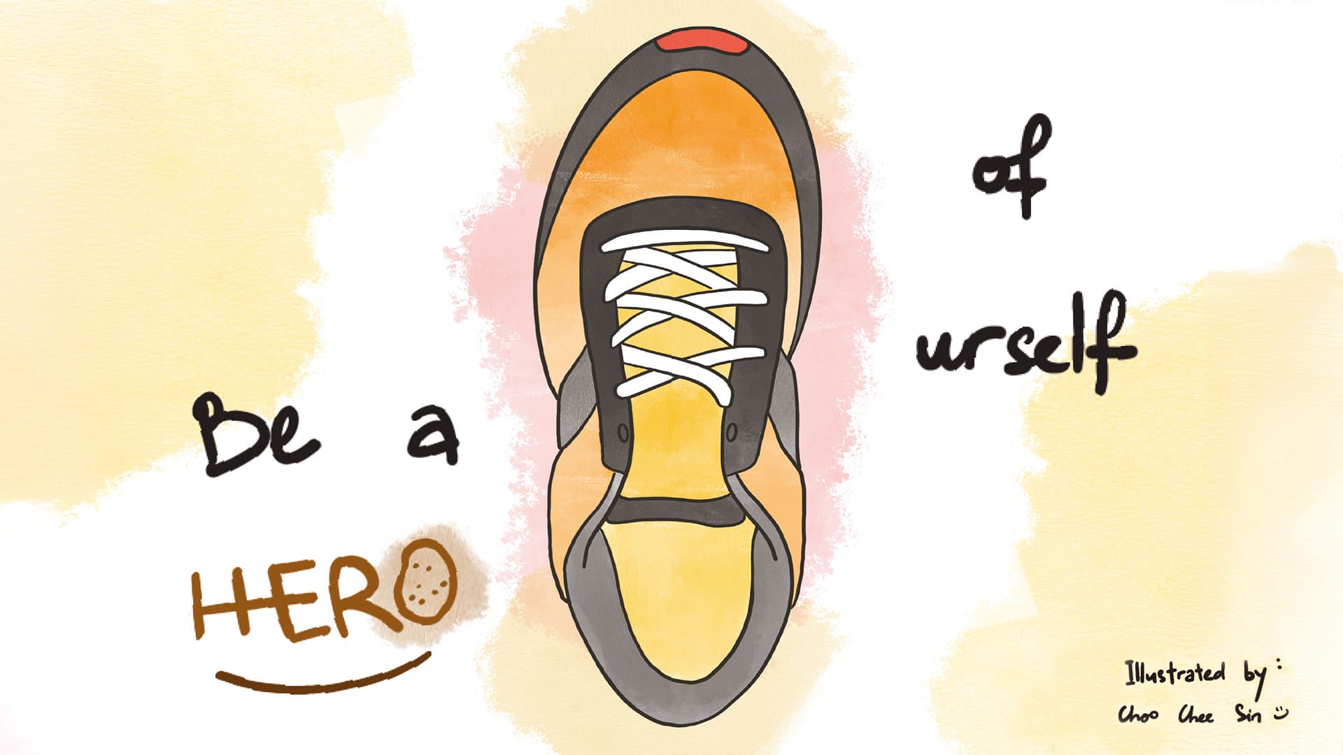
Be a Hero of Urself
A Zine documenting 60 years of resilience by a Subang cobbler, celebrating manual labor’s dignity.
03
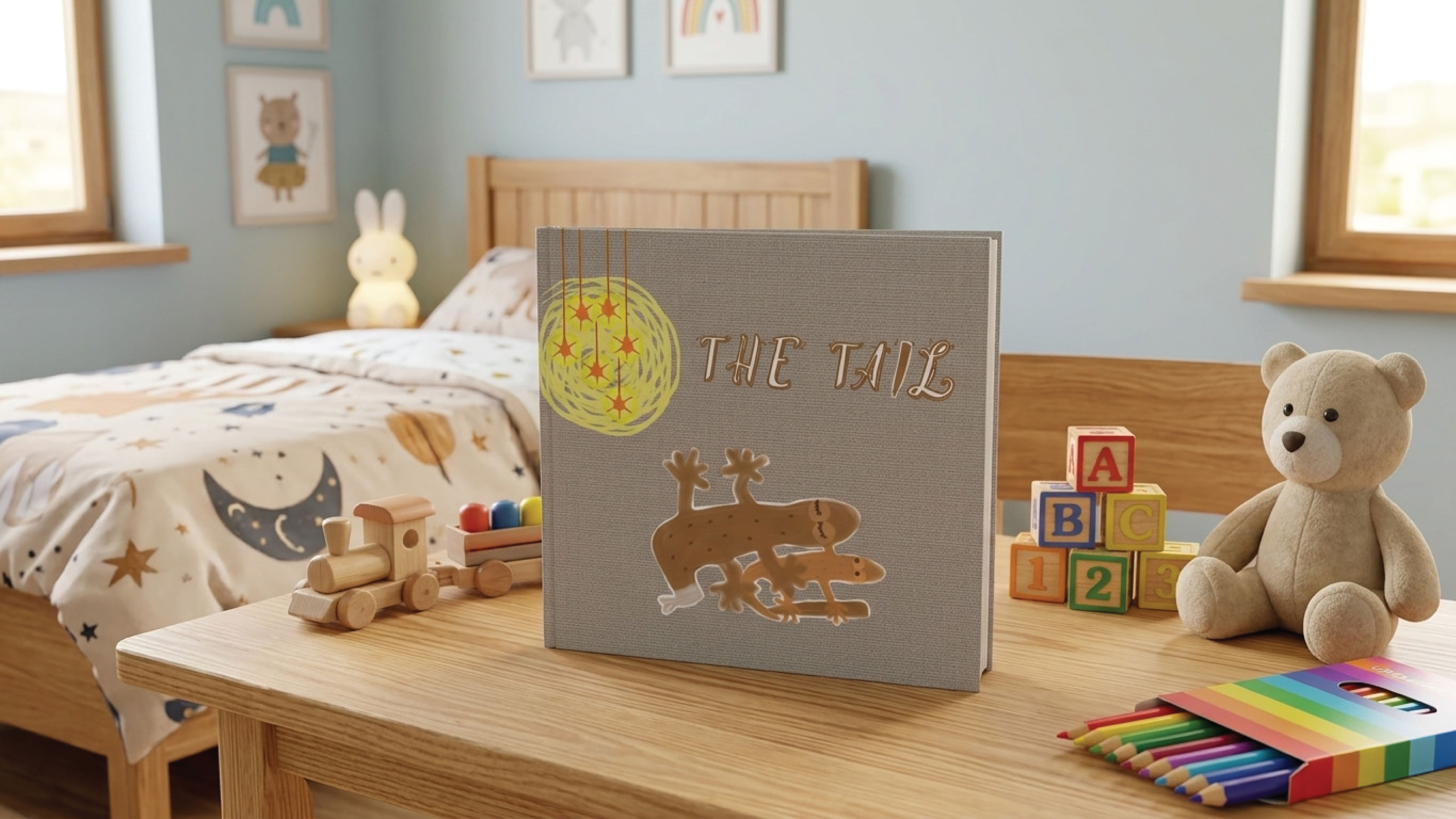
The Tail
A picture book exploring the power of growth and renewal. Inspired by lizard resilience, it uses minimalist design to frame loss as a brave new beginning.